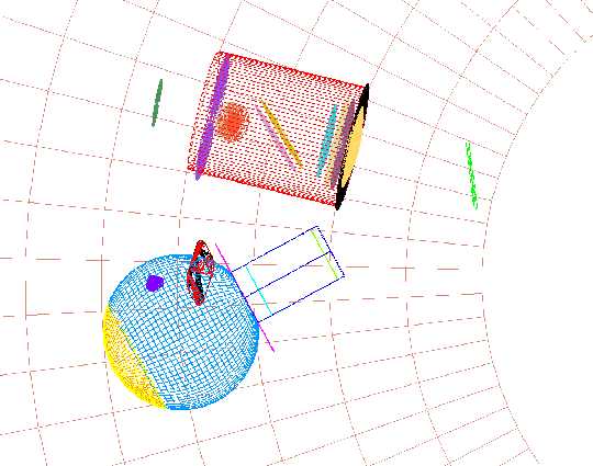
 There are two
each of the "diving board" baffles and source entrance
orifices, one above and one below the horizontal symmetry plane
in this view. This is not quite a view looking forward.
There are two
each of the "diving board" baffles and source entrance
orifices, one above and one below the horizontal symmetry plane
in this view. This is not quite a view looking forward.Integrating Sphere ASAP Analysis
Dennis Evans
Evans Engineering
February 21-March 3, 2000
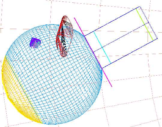
Figure 1 -- Channel 4 Path (left); ---------- Figure 2 -- Close-up of the ASAP model of the 3-inch diameter integrating sphere (right).
There are two
each of the "diving board" baffles and source entrance
orifices, one above and one below the horizontal symmetry plane
in this view. This is not quite a view looking forward.
These are views of the ASAP model for IRAC Channel 4, looking generally forward in the direction of the Telescope Optical Axis (the Code-V, ZEMAX, ASAP, and AutoCAD minus-Z direction).
From the bottom up:
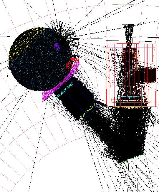 Figure
3: A plot of the raytrace.
Only every 100th ray
is plotted.
Figure
3: A plot of the raytrace.
Only every 100th ray
is plotted.
The starburst of rays at the top of the integrating sphere are the ones leaked out around the edge of the source, which did not quite fill the orifice plate. There is a preferred scattering direct reflection back from the opposite wall of the 3-inch sphere. It is really apparent when the inside wall is considered a mirror instead of diffuser. More rays leak out of this tiny gap than leak out the open hole on the opposite side. Actually, there is nothing for the rays to hit going out the lower orifice, so most of them are truncated inside the 3-inch sphere. I should have put a blocker baffle over these exits. They rays don’t go near the Channel 4 Detector, but do reflect off the back of the Primary Mirror. Split is set to "1" at every surface. Transmission ghosts can’t be formed in this raytrace, but there were none that looked significant in the "28-mm Disk" source approximation earlier.
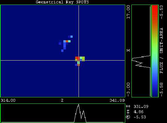
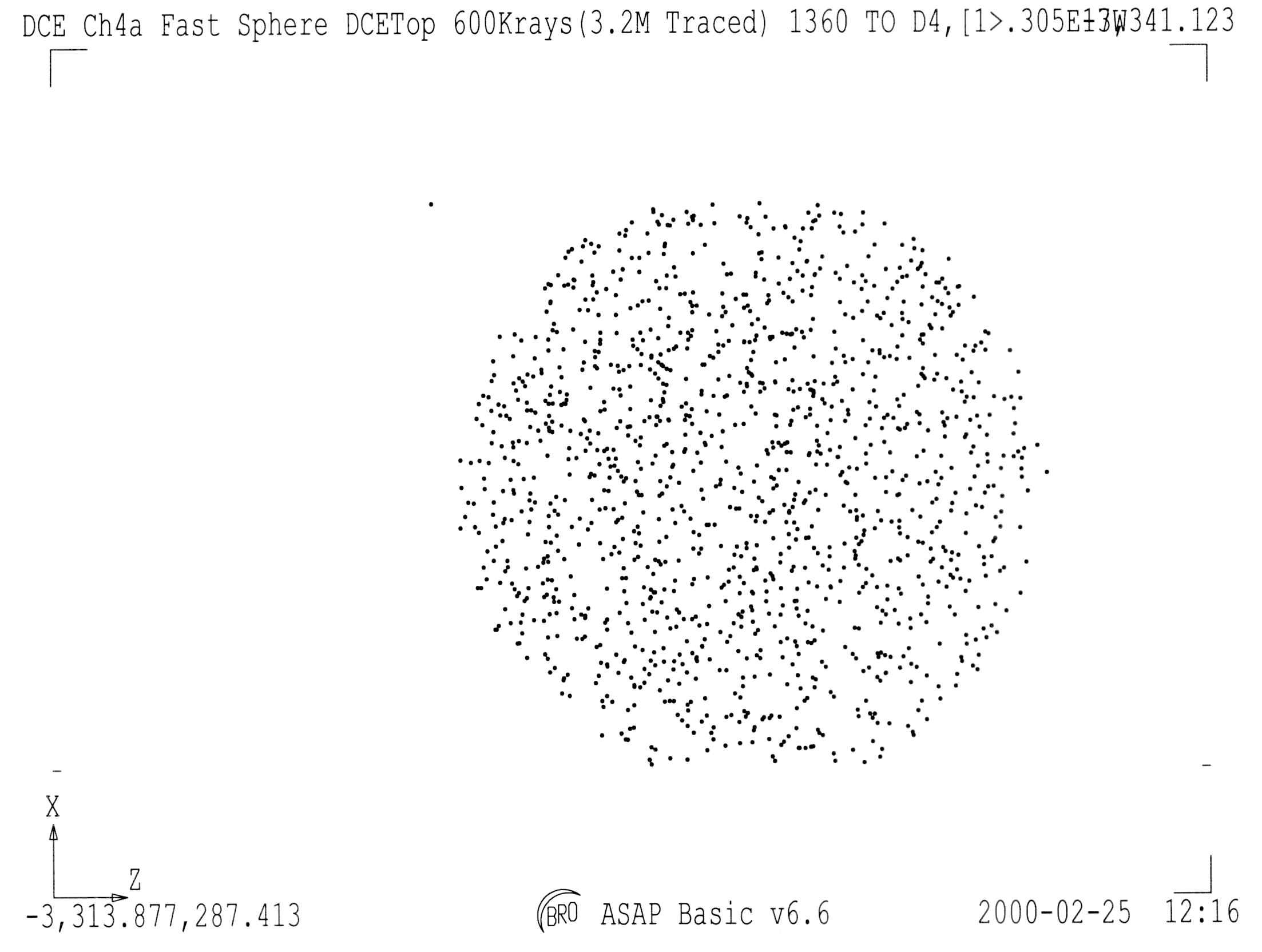 Figure 4: Detector 4
Image Plane - 1360 of 3-million rays.
Figure 4: Detector 4
Image Plane - 1360 of 3-million rays.
This is the "SPOTS" plot from ASAP for the 600,000 source rays from the orifice plate. Only 1360 rays get to the detector plane. In this plot there is one stray ray that might come from an illegal direction (one that really doesn’t exist in IRAC), but 1/1360 is statistically insignificant. All ray spots are plotted in this image, not 1 of every 100 like in the raytrace. For the "PICTURES’ which follow, the data are binned in 11 by 11 pixel sets where 101 pixels represent the distance from the top to the bottom of this SPOTS plot. The RMS random variation in the PICTURES is a minimum of 9% and could easily be close to 20%. There is some irregularity in the PICTURES at low percentage clipping, but it doesn’t seem to correspond to anything but digital noise.
There is no such variation in the "PICTURES" created of the back of the integrating sphere. In the Integrating sphere images there are 156942 spots (115 time more than the Detector Image). The RMS noise should be about 0.8% for equivalent image averaging. I don’t see anything that looks like irregular integrating sphere illumination, only statistical noise.
There is some vignetting at the top and bottom of the spots caused by the tunnel aperture closest to the Integrating Sphere 28-mm aperture.
The following "PICTURES" are generated by ASAP from the SPOTS plot shown in Figure 5.
Figures 5 - 9 have a flux rang from the
"Peak Flux" to the "Lower Cutoff Flux and Cutoff
signal percentage".
Peak = -5.53 100%: Lower Cutoff = -7.53 1%; -6,53 10%; -5.83 50%;
-5.66 75%; -5.58 89%
The PICTURE is a logarithmic display of flux intensity. The Peak Flux is the highest intensity in the picture. The Cutoff Flux is the lowest flux level displayed in the picture. For Figure 5 the range is 100% to 1% - two orders of magnitude. For Figure 9 only the range 100% to 89% is shown.
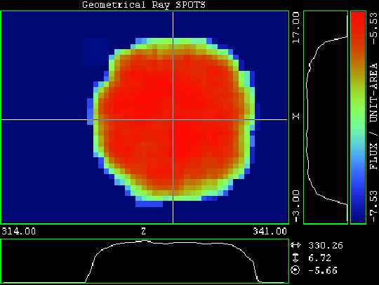 Figure 5: Logarithmic Flux Display of Spots from
Figure 4
Figure 5: Logarithmic Flux Display of Spots from
Figure 4
Peak Flux : -5.53 100%:
Lower Cutoff: -7.53 1%
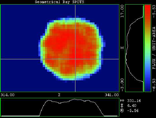 Figure 6: Logarithmic Flux Display of Spots from
Figure 4
Figure 6: Logarithmic Flux Display of Spots from
Figure 4
Peak Flux : -5.53 100%:
Lower Cutoff: -6,53 10%
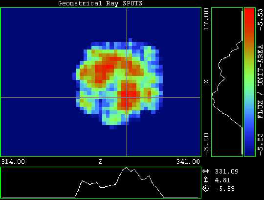 Figure
7: Logarithmic Flux Display of Spots from Figure 4
Figure
7: Logarithmic Flux Display of Spots from Figure 4
Peak Flux : -5.53 100%
Lower Cutoff: -5.83 50%
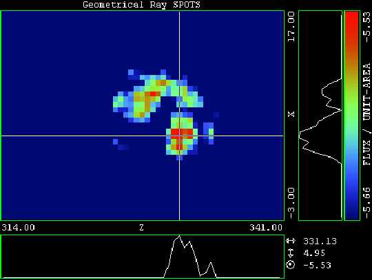 Figure
8: Logarithmic Flux Display of Spots from Figure 4
Figure
8: Logarithmic Flux Display of Spots from Figure 4
Peak Flux : -5.53 100%:
Lower Cutoff: -5.66 75%
 Figure
9: Logarithmic Flux Display of Spots from Figure 4
Figure
9: Logarithmic Flux Display of Spots from Figure 4
Peak Flux : -5.53 100%:
Lower Cutoff: -5.58 89%
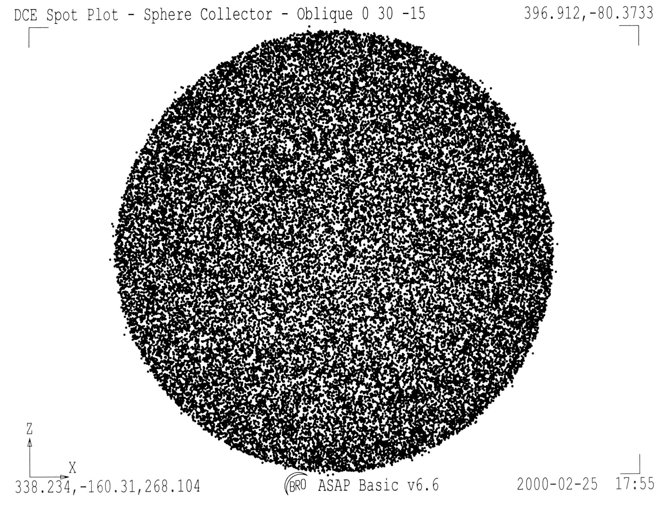 Figure 10: SPOTS
plotted for the back of the 3-inch Integrating Sphere (See Yellow
element in Figures 1 & 2)
Figure 10: SPOTS
plotted for the back of the 3-inch Integrating Sphere (See Yellow
element in Figures 1 & 2)
42634 Rays
There are no obvious illumination non-uniformities in the spot plot, but the spot plot does not account for the intensity of each ray. This view is for the hemisphere projected onto a plane perpendicular to the tangent point of the center of this element. In Figures 12 & 13, the PICTURE versions of this spot plot, the "limb brightening" caused by the projection is evident.
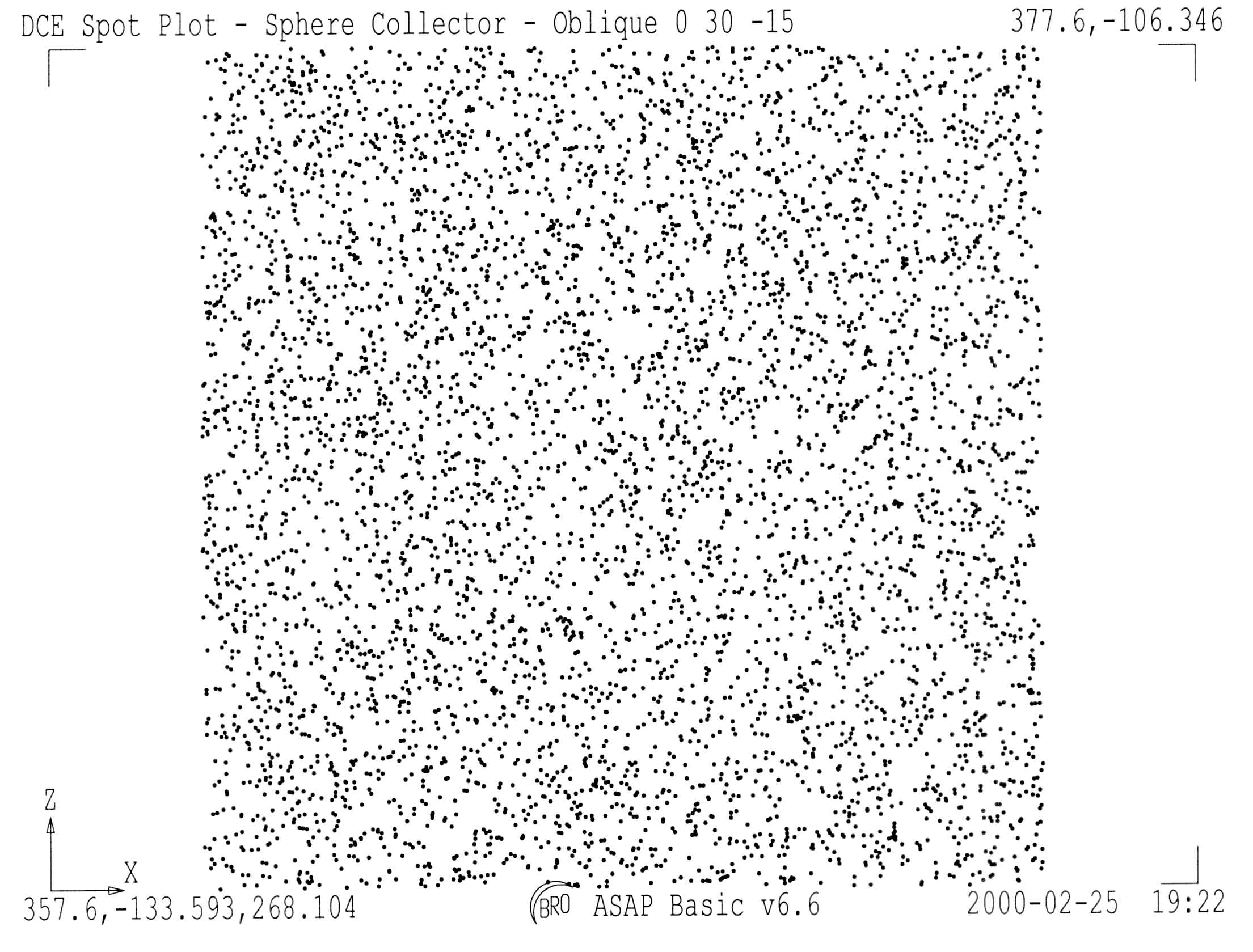 Figure
11: SPOTS plotted over a 28-mm square centered on the back of the
3-inch Integrating Sphere
Figure
11: SPOTS plotted over a 28-mm square centered on the back of the
3-inch Integrating Sphere
5403 rays
 Figure
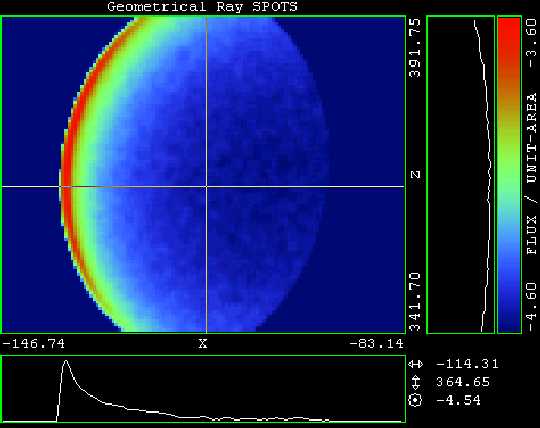
12: A PICTURE of the SPOTS shown in Figure 10 without aligning
the element perpendicular to the view direction. The Limb
brightening on the left is because the flux density is computed
for a plane surface perpendicular to the view direction and the
real surface is a sphere.
Figure
12: A PICTURE of the SPOTS shown in Figure 10 without aligning
the element perpendicular to the view direction. The Limb
brightening on the left is because the flux density is computed
for a plane surface perpendicular to the view direction and the
real surface is a sphere.
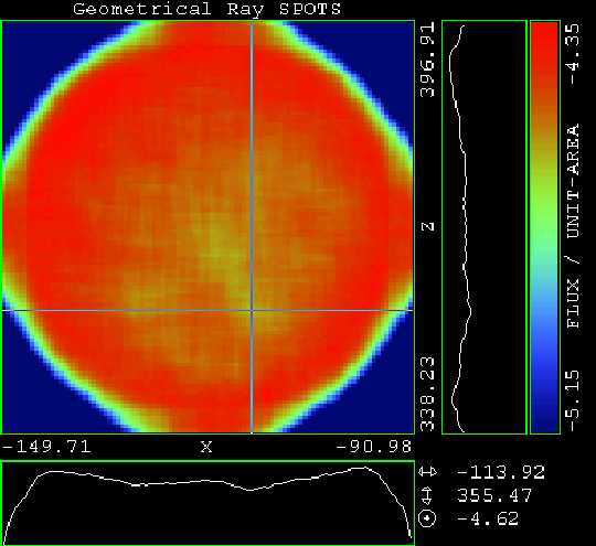 Figure 13: A PICTURE
of the SPOTS shown in Figure 10 without the center of the element
perpendicular to the view direction.
Figure 13: A PICTURE
of the SPOTS shown in Figure 10 without the center of the element
perpendicular to the view direction.
 Figure
14: A PICTURE version of Figure 11 - SPOTS plotted over a 28-mm
square centered on the back of the 3-inch Integrating Sphere
Figure
14: A PICTURE version of Figure 11 - SPOTS plotted over a 28-mm
square centered on the back of the 3-inch Integrating Sphere
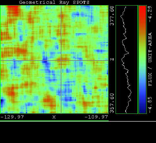
5403 rays (4.3% RMS)
10**-4.29=5.12E-5=100% peak,
10**-4.85=1.41E-5=27% cutoff low; flux/unit area).
Average 5 5
I don't see anything in these pictures that convinces me that the variability is anything but digital statistical noise being viewed at different scales.